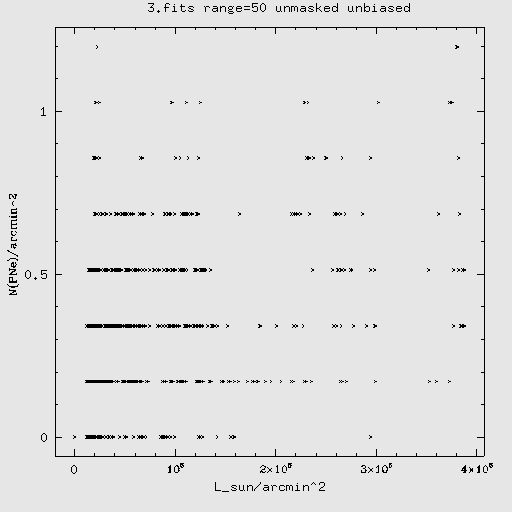
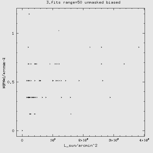
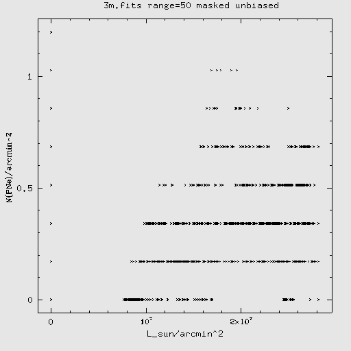
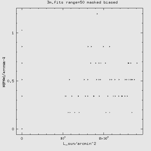
PNe statistics
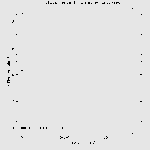
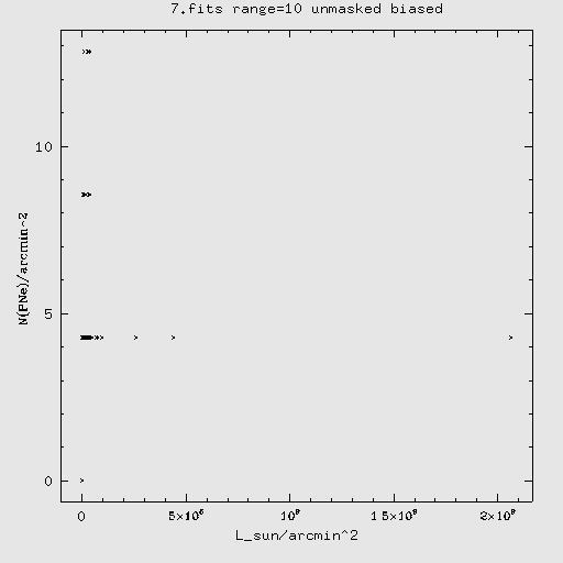
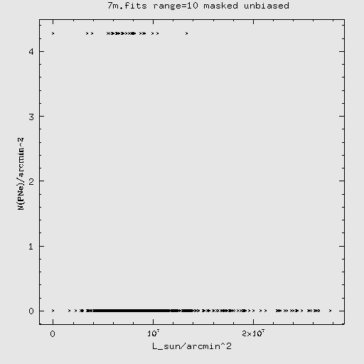
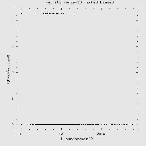
This is a continuation in the comparison with PNe data, this time from
Feldmeier. Our aim on this page is to see if there is any correlation
between the location of PNe and of ICL (i.e. the unmasked pixels in our
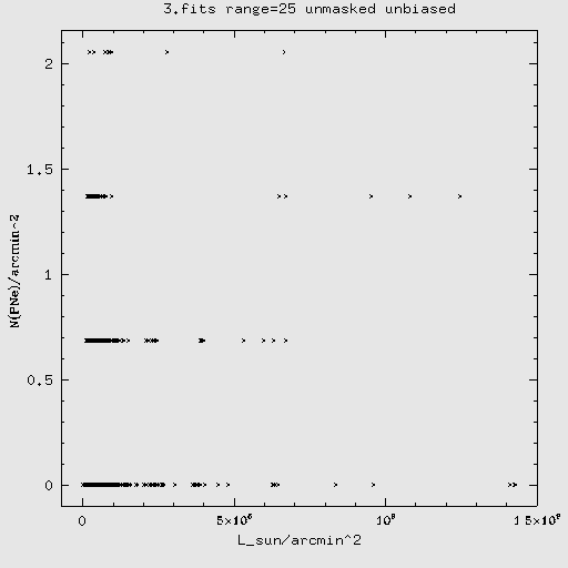
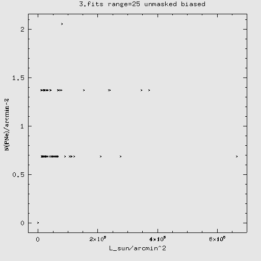
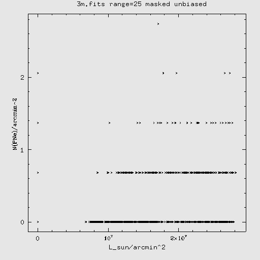
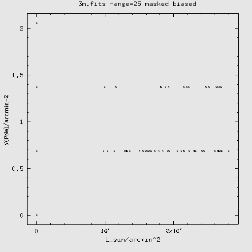
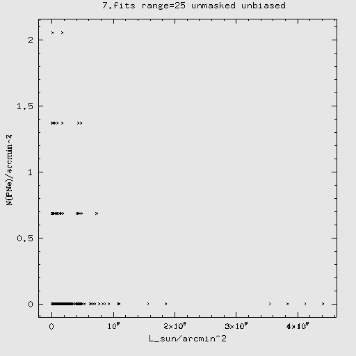
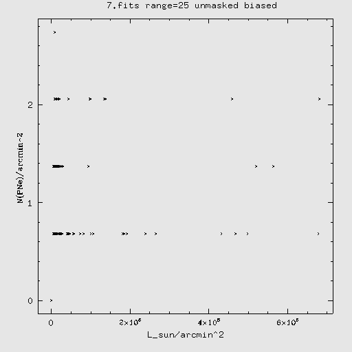
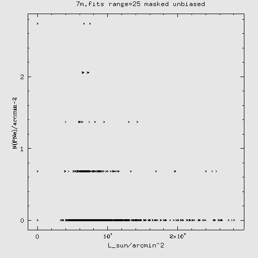
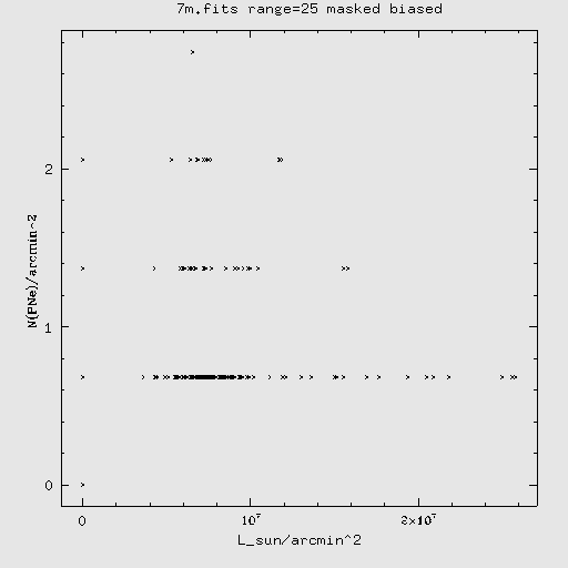
images). To do this we generate the following graphs with this method:
1) select a square region of size r with a
location determined by the method being used
2) count the number of PNe in that region by using the Feldmeier
catalog data file and get them into density: N / arcmin^2
3) average the intensity on the pixels in that region and convert to
L_sun / arcmin^2
The other two important parameters that can be varied are:
- which image of ours we used: masked or unmasked
- how the selection of regions is done
We will use BOTH the masked image and the unmasked to see differences
between them.
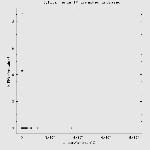
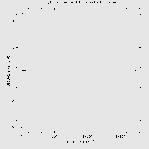
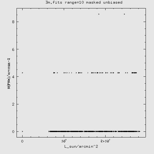
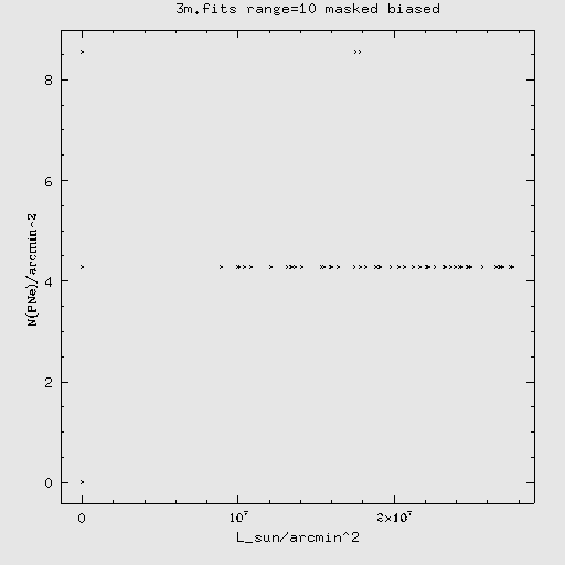
For selection, we will do one run with completely random selection
(unbiased - 1,000 random selections are made) and one run selecting
regions that each have a PN at their center (biased).
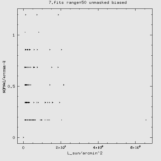
Given below are the resulting graphs for 3.fits and 7.fits. We omitted 4.fits to save time and do not
expect that it would be very different anyway.
For both fields, the range (r) is varied
through values of 10, 25 and 50. This range is not actually the "size"
of the box, but the size of the square box is 2*range + 1.
For each value the method was performed on the masked and unmasked image with biased and unbiased selection.
notes:
> The data point appearing at (0,0) in every graph is an artifact of
SM's fits reading that should have been manually removed. It was not
noticed until after the (time-consuming) procedures had been completed.
> In the masked samples, there may be more than one data point
co-existing at L_sun/arcmin^2 = 0 as some random regions do not
actually have ANY (unmasked) pixels in them.
Code: /Virgo/FeldPNe/PNe_run.sm PNe_run <-- all night running
version to get a lot of data processed
/Virgo/FeldPNe/PNe_run.sm
r <-- reconstructive program to take the data outputs of PNe_run and
generate the graphs
3.fits


7.fits


[this one was taking too long and wouldn't have shown much
different/insightful] 
[this one was taking too long and wouldn't have shown much
different/insightful]
OK so those aren't very conclusive, let's try
another approach that selects regions a little differently
Back to MCu statistics page
Back to main Virgo page
